19 KiB
Theme format 3.0
The way rofi handled widgets has changed in the last few releases. Widgets are now put into containers, allowing themes to be much more flexible than before. To expose these new theming abilities a new theming format has been created, replacing the old one. It is loosely based on css, a format widely known, which allows e.g. web developers to create their own rofi themes without learning a new markup.
This file is split up into 3 sections:
- Specification of the file format
- List of possible options
- Examples
File Format Specification
Encoding
The encoding of the file is utf-8. Both unix (\n) and windows (\r\n)
newlines format are supported. But unix is preferred.
Comments
C and C++ file comments are support.
- Anything after
//and before a newline is considered a comment. - Everything between
/*and*/is a comment.
Comments can be nested and the C comments can be inline.
The following is valid:
// Magic comment.
property: /* comment */ value;
However this is not:
prop/*comment*/erty: value;
White space
White space and newlines, like comments, are ignored by the parser.
This:
property: name;
Is identical to:
     property             :
name

;
File extension
The preferred file extension for the new theme format is rasi. This is an abbreviation for rofi advanced style information.
Basic Structure
Each element has a section with defined properties. Properties can be inherited
to sub-sections. Global properties can be defined in section * { }.
Sub-section names begin with a hash symbol #.
It is advised to define the global properties section on top of the file to make inheritance of properties clearer.
/* Global properties section */
* {
    // list of properties
}

/* Element theme section. */
#{element path} {
    // list of properties
}
#{elements... } {
    // list of properties
}
Global properties section
A theme can have one or more global properties sections (If there is more than one they will be merged)
The global properties section denotes the defaults for each element.
Each property of this section can be referenced with @{identifier}
(See Properties section)
Element theme section
A theme can have multiple element theme sections.
The element path can consist of multiple names separated by whitespace or dots.
Each element may contain any number of letters, numbers and '-'.
The first element should always start with a #.
This is a valid element name:
#window mainbox listview element normal.normal {
}
And is identical to:
#window.mainbox.listview.element normal.normal {
}
Each section inherits the properties of its parents. Inherited properties
can be overridden by defining them again in the section itself.
So #window mainbox will contain all properties of #window and #window mainbox.
In the following example:
#window {
 a: 1;
 b: 2;
}
#window mainbox {
    b: 4;
    c: 8;
}
The element #window mainbox will have the following set of properties:
a: 1;
b: 4;
c: 8;
If multiple sections are defined with the same name, they are merged by the parser. If multiple properties with the same name are defined in one section, the last encountered property is used.
Properties
The properties in a section consist of:
{identifier}: {value};
Both fields are manditory for a property.
The identifier names the specified property. Identifiers can consist of any
combination of numbers, letters and '-'. It must not contain any whitespace.
The structure of the value defines the type of the property.
The current theme format support different type:
- a string.
- an integer number.
- a fractional number.
- a boolean value.
- a color.
- text style.
- line style.
- a distance.
- a padding.
- a border.
- a position.
- a reference.
Some of these types are a combination of other types.
String
- Format:
"[:print:]+"
A string is always surrounded by quotes ('"'), between the quotes it can have any printable character.
For example:
font: "Awasome 12";
Integer
- Format:
[-+]?[:digit:]+
An integer may contain any number.
For examples:
lines: 12;
Real
- Format:
[-+]?[:digit:]+(\.[:digit:]+)?
A real is an integer with an optional fraction.
For example:
real: 3.4;
The following is not valid: .3, 3. or scientific notation: 3.4e-3.
Boolean
- Format:
(true|false)
Boolean value is either true or false. This is case-sensitive.
For example:
dynamic: false;
Color
- Format:
#{HEX}{6} - Format:
#{HEX}{8} - Format:
rgb({INTEGER},{INTEGER},{INTEGER}) - Format:
rgba({INTEGER},{INTEGER},{INTEGER}, {REAL})
Where '{HEX}' is a hexidecimal number ('0-9a-f'). The '{INTEGER}' value can be between 0 and 255, the '{Real}' value between 0.0 and 1.0.
The first formats specify the color as RRGGBB (R = red, G = green, B = Blue), the second adds an alpha (A) channel: AARRGGBB.
For example:
background: #FF0000;
foreground: rgba(0,0,1, 0.5);
Text style
- Format:
(bold|italic|underline|none)
Text style indicates how the text should be displayed. None indicates no style should be applied.
Line style
- Format:
(dash|solid)
Indicates how a line should be drawn. It currently supports:
dash: A dashed line. Where the gap is the same width as the dash.solid: A solid line.
Distance
- Format:
{Integer}px - Format:
{Real}em - Format:
{Real}%
A distance can be specified in 3 different units:
px: Screen pixels.em: Relative to text width.%: Percentage of the monitor size. Distances used in the horizontal direction use the monitor width. Distances in the vertical direction use the monitor height. For example:
padding: 10%;
On a full-hd (1920x1080) monitor defines a padding of 192 pixels on the left and right side and 108 pixels on the top and bottom.
Padding
- Format:
{Integer} - Format:
{Distance} - Format:
{Distance} {Distance} - Format:
{Distance} {Distance} {Distance} - Format:
{Distance} {Distance} {Distance} {Distance}
If no unit is set, pixels are used.
The different number of fields in the formats are parsed like:
- 1 field:
all - 2 fields:
top&bottomleft&right - 3 fields:
top,left&right,bottom - 4 fields:
top,right,bottom,left
Border
- Format:
{Integer} - Format:
{Distance} - Format:
{Distance} {Distance} - Format:
{Distance} {Distance} {Distance} - Format:
{Distance} {Distance} {Distance} {Distance} - Format:
{Distance} {Line style} - Format:
{Distance} {Line style} {Distance} {Line style} - Format:
{Distance} {Line style} {Distance} {Line style} {Distance} {Line style} - Format:
{Distance} {Line style} {Distance} {Line style} {Distance} {Line style} {Distance} {Line style}
Border are identical to padding, except that each distance field has a line style property.
Position
- Format:
(center|east|north|west|northeast|northweast|south|southwest|southeast)
Reference
- Format:
@{PROPERTY NAME}
A reference can point to another reference. Currently the maximum number of redirects is 20. A property always refers to another property. It cannot be used for a subpart of the property. e.g. this is not valid:
highlight: bold @pink;
Elements Paths
Element paths exists of two parts, the first part refers to the actual widget by name. Some widgets have an extra state.
For example:
#window mainbox listview element .selected {
}
Here #window mainbox listview element is the name of the widget, selected is the state of the widget.
The difference between dots and spaces is purely cosmetic. These are all the same:
#window mainbox listview element .selected {
}
#window.mainbox.listview.element.selected {
}
#window mainbox listview element selected {
}
Name
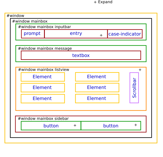
The current widgets exist in rofi:
#window#window.box: The container holding the window.#window.overlay: The overlay widget.#window.mainbox#window.mainbox.box: The main vertical @box#window.mainbox.inputbar#window.mainbox.inputbar.box: The horizontal @box packing the widgets.#window.mainbox.inputbar.case-indicator: The case/sort indicator @textbox#window.mainbox.inputbar.prompt: The prompt @textbox#window.mainbox.inputbar.entry: The main entry @textbox
#window.mainbox.listview#window.mainbox.listview.box: The listview container.#window.mainbox.listview.scrollbar: The listview scrollbar#window.mainbox.listview.element: The entries in the listview
#window.mainbox.sidebar#window.mainbox.sidebar.box: The main horizontal @box packing the buttons.#window.mainbox.sidebar.button: The buttons @textbox for each mode.
#window.mainbox.message#window.mainbox.message.textbox: The message textbox.#window.mainbox.message.box: The box containing the message.
Or in a graphical depiction:
State
State: State of widget
Optional flag(s) indicating state.
These are appended after the name or class of the widget.
#window.mainbox.sidebar.button selected.normal { }
#window.mainbox.listview.element selected.urgent { }
Currently only the entrybox and scrollbar have states:
{visible modifier}.{state}
Where visible modifier can be:
- normal: No modification.
- selected: The entry is selected/highlighted by user.
- alternate: The entry is at an alternating row. (uneven row)
Where state is:
- normal: No modification.
- urgent: This entry is marked urgent.
- active: This entry is marked active.
These can be mixed.
Example:
#name.to.textbox selected.active {
    background: #003642;
    foreground: #008ed4;
}
Sets all selected textboxes marked active to the given foreground and background color.
The scrollbar uses the handle state when drawing the small scrollbar handle.
This allows the colors used for drawing the handle to be set independently.
Supported properties
The following properties are currently supports:
-
all widgets:
- padding: padding Padding on the inside of the widget.
- margin: padding Margin on the outside of the widget.
- border: border Border around the widget (between padding and margin)/
- border-radius: padding Sets a radius on the corners of the borders.
- background: color Background color.
- foreground: color Foreground color.
- index: integer (This one does not inherits it value from the parent widget)
-
window:
- font: string
- transparency: string
- real
- background
- screenshot
- Path to png file
- position: position The place of the anchor on the monitor.
- anchor: anchor The anchor position on the window.
- fullscreen: boolean Window is fullscreen.
- width: distance The width of the window.
- x-offset: distance
- y-offset: distance The offset of the window to the anchor point. Allowing you to push the window left/right/up/down.
-
scrollbar
- foreground: color
- handle-width: distance
- handle-color: color
- foreground: color
-
box
- spacing: distance Distance between the packed elements.
-
textbox:
- background: color
- foreground: color
- text: The text color to use (falls back to foreground if not set)
- highlight: highlight {color} Color is optional, multiple highlight styles can be added like: bold underlinei italic #000000;
-
listview:
- columns: integer Number of columns to show (atleast 1).
- fixed-height: boolean
Always show
linesrows, even if less elements are available. - dynamic: boolean If the size should changed when filtering the list, or if it should keep the original height.
- scrollbar: boolean If the scrollbar should be enabled/disabled.
- scrollbar-width: distance Width of the scrollbar
- cycle: boolean When navigating it should wrap around.
- spacing: distance Spacing between the elements (both vertical and horizontal)
- lines: integer Number of rows to show in the list view.
Examples
Arthur
A simple theme showing basic theming and transparent background:
* {
    foreground:  #ffeedd;
    background:  rgba(0,0,0,0);
    dark: #1c1c1c;
    // Black
    black:       #3d352a;
    lightblack:  #554444;
    //
    // Red
    red:         #cd5c5c;
    lightred:    #cc5533;
    //
    // Green
    green:       #86af80;
    lightgreen:  #88cc22;
    //
    // Yellow
    yellow:      #e8ae5b;
    lightyellow:     #ffa75d;
    //
    // Blue
    blue:      #6495ed;
    lightblue:     #87ceeb;
    //
    // Magenta
    magenta:      #deb887;
    lightmagenta:     #996600;
    //
    // Cyan
    cyan:      #b0c4de;
    lightcyan:     #b0c4de;
    //
    // White
    white:      #bbaa99;
    lightwhite:     #ddccbb;
    //
    // Bold, Italic, Underline
    highlight:     bold #ffffff;
}
#window {
    location: center;
    anchor:   north;
    y-offset: -5em;
}
#window box {
    padding: 10px;
    border:  1px;
    foreground: @magenta;
    background: #cc1c1c1c;
}

#window mainbox inputbar {
    background: @lightblack;
    text: @lightgreen;
    padding: 4px;
}
#window mainbox inputbar box {
    border: 0px 0px 2px 0px;
}
#window mainbox box {
    spacing: 0.3em;
}

#window mainbox listview {
    dynamic: false;
}
#window mainbox listview element selected  normal {
    background: @blue;
}
#window mainbox listview element normal active {
    foreground: @lightblue;
}
#window mainbox listview element normal urgent {
    foreground: @lightred;
}
#window mainbox listview element alternate normal {
}
#window mainbox listview element alternate active {
    foreground: @lightblue;
}
#window mainbox listview element alternate urgent {
    foreground: @lightred;
}
#window mainbox listview element selected active {
    background: @lightblue;
    foreground: @dark;
}
#window mainbox listview element selected urgent {
    background: @lightred;
    foreground: @dark;
}
#window mainbox listview element normal normal {

}
Sidebar
The previous theme modified to behave like a sidebar, positioned on the left of the screen.
* {
    foreground:  #ffeedd;
    background:  rgba(0,0,0,0);
    dark: #1c1c1c;
    // Black
    black:       #3d352a;
    lightblack:  #554444;
    //
    // Red
    red:         #cd5c5c;
    lightred:    #cc5533;
    //
    // Green
    green:       #86af80;
    lightgreen:  #88cc22;
    //
    // Yellow
    yellow:      #e8ae5b;
    lightyellow:     #ffa75d;
    //
    // Blue
    blue:      #6495ed;
    lightblue:     #87ceeb;
    //
    // Magenta
    magenta:      #deb887;
    lightmagenta:     #996600;
    //
    // Cyan
    cyan:      #b0c4de;
    lightcyan:     #b0c4de;
    //
    // White
    white:      #bbaa99;
    lightwhite:     #ddccbb;
    //
    // Bold, Italic, Underline
    highlight:     bold #ffffff;
}
#window {
    width: 30em;
    location: west;
    anchor:   west;
}
#window box {
    border:  0px 2px 0px 0px;
    foreground: @lightwhite;
    background: #ee1c1c1c;
}

#window mainbox sidebar box {
    border: 2px 0px 0px 0px;
    background: @lightblack;
    padding: 10px;
}
#window mainbox sidebar selected {
    foreground: @lightgreen;
    text: @lightgreen;
}
#window mainbox inputbar {
    background: @lightblack;
    text: @lightgreen;
    padding: 4px;
}
#window mainbox inputbar box {
    border: 0px 0px 2px 0px;
}
#window mainbox box {
    spacing: 1em;
}
#window mainbox listview box {
    padding: 0em 0.4em 0em 1em;
}
#window mainbox listview {
    dynamic: false;
    lines: 9;
}
#window mainbox listview element selected  normal {
    background: @blue;
}
#window mainbox listview element normal active {
    foreground: @lightblue;
}
#window mainbox listview element normal urgent {
    foreground: @lightred;
}
#window mainbox listview element alternate normal {
}
#window mainbox listview element alternate active {
    foreground: @lightblue;
}
#window mainbox listview element alternate urgent {
    foreground: @lightred;
}
#window mainbox listview element selected active {
    background: @lightblue;
    foreground: @dark;
}
#window mainbox listview element selected urgent {
    background: @lightred;
    foreground: @dark;
}
#window mainbox listview element normal normal {

}
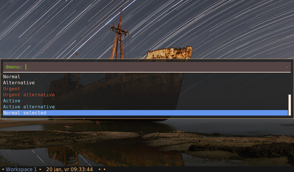
Paper Float
A theme that shows a floating inputbar.
TODO: cleanup this theme.
* {
    blue:  #0000FF;
    white: #FFFFFF;
    black: #000000;
    grey:  #eeeeee;

    spacing: 2;
    background: #00000000;
    anchor: north;
    location: center;
}
#window {
    transparency: "screenshot";
    background: #00000000;
    border: 0;
    padding: 0% 0% 1em 0%;
    foreground: #FF444444;
    x-offset: 0;
    y-offset: -10%;
}
#window.mainbox {
    padding: 0px;
}
#window.mainbox.box {
    border: 0;
    spacing: 1%;
}
#window.mainbox.message.box {
    border: 2px;
    padding: 1em;
    background: @white;
    foreground: @back;
}
#window.mainbox.message.normal {
    foreground: #FF002B36;
    padding: 0;
    border: 0;
}
#window.mainbox.listview {
    fixed-height: 1;
    border: 2px;
    padding: 1em;
    reverse: false;

    columns: 1;
    background: @white;
}
#window.mainbox.listview.element {
    border: 0;
    padding: 2px;
    highlight: bold ;
}
#window.mainbox.listview.element.normal.normal {
    foreground: #FF002B36;
    background: #00F5F5F5;
}
#window.mainbox.listview.element.normal.urgent {
    foreground: #FFD75F00;
    background: #FFF5F5F5;
}
#window.mainbox.listview.element.normal.active {
    foreground: #FF005F87;
    background: #FFF5F5F5;
}
#window.mainbox.listview.element.selected.normal {
    foreground: #FFF5F5F5;
    background: #FF4271AE;
}
#window.mainbox.listview.element.selected.urgent {
    foreground: #FFF5F5F5;
    background: #FFD75F00;
}
#window.mainbox.listview.element.selected.active {
    foreground: #FFF5F5F5;
    background: #FF005F87;
}
#window.mainbox.listview.element.alternate.normal {
    foreground: #FF002B36;
    background: #FFD0D0D0;
}
#window.mainbox.listview.element.alternate.urgent {
    foreground: #FFD75F00;
    background: #FFD0D0D0;
}
#window.mainbox.listview.element.alternate.active {
    foreground: #FF005F87;
    background: #FFD0D0D0;
}
#window.mainbox.listview.scrollbar {
    border: 0;
    padding: 0;
}
#window.mainbox.inputbar {
    spacing: 0;
}
#window.mainbox.inputbar.box {
    border: 2px;
    padding: 0.5em 1em;
    background: @grey;
    index: 0;
}
#window.mainbox.inputbar.normal {
    foreground: #FF002B36;
    background: #00F5F5F5;
}

#window.mainbox.sidebar.box {
    border: 2px;
    padding: 0.5em 1em;
    background: @grey;
    index: 10;
}
#window.mainbox.sidebar.button selected {
    text: #FF4271AE;
}