7.8 KiB
Tutorial on how to write a theme 3.0
I started this theme by picking a color scheme I wanted to use, i want for Arthur.
We first create an empty theme file: arthur.rasi
* {

}
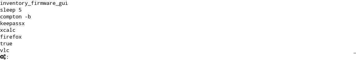
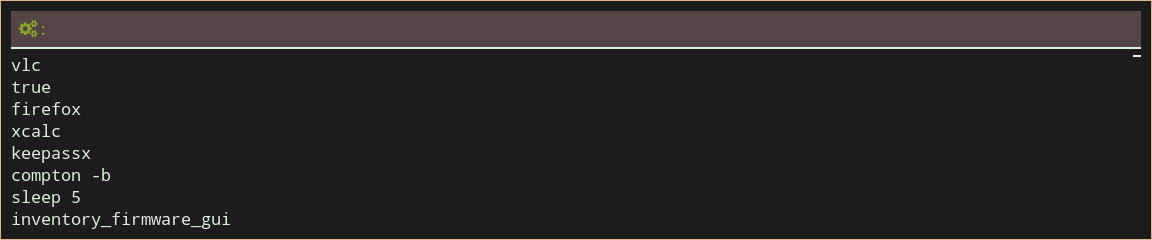
We can preview this with rofi -theme arthur.rasi -show run. At this stage we see a black and white window.
Lets add the different colors to the global properties:
/**
 * Arthur color scheme
 */
* {
    // Foreground
    foreground:  #ddeedd;
    background:  #1c1c1c;
    // Black
    black:       #3d352a;
    lightblack:  #554444;
    //
    // Red
    red:         #cd5c5c;
    lightred:    #cc5533;
    //
    // Green
    green:       #86af80;
    lightgreen:  #88aa22;
    //
    // Yellow
    yellow:      #e8ae5b;
    lightyellow:     #ffa75d;
    //
    // Blue
    blue:      #6495ed;
    lightblue:     #87ceeb;
    //
    // Magenta
    magenta:      #deb887;
    lightmagenta:     #996600;
    //
    // Cyan
    cyan:      #b0c4de;
    lightcyan:     #b0c4de;
    //
    // White
    white:      #bbaa99;
    lightwhite:     #ddccbb;
    //
    // Highlights
    highlight:     bold #ffffff;

}
As shown in this example, both C and C++ style comments are allows. We set the default foreground and background color, and add some aliases for other colors we can use.
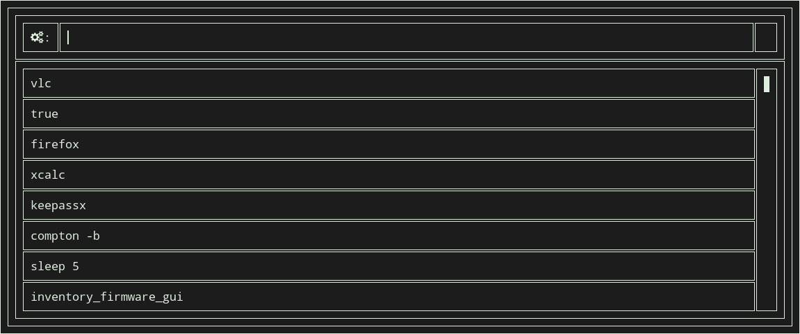
As you can seen in the screenshot each widget takes the global background and foreground color.
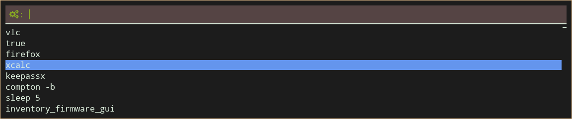
We can now start adding sections to customize the layout and looks. Lets first start by placing rofi in the middle of the screen.
#window {
    location: center;
    anchor:   north;
}
The location property determines the position on the monitor, the anchor property sets the point on the rofi window
that stays fixed at the monitor position.
In this case the top (north) of the rofi window is at the center of the monitor.
We want to give the window, and each child, a padding of 10 pixels and a 1 pixel border.
#window {
    location: center;
    anchor:   north;
    padding:  10px;
    border:  1px;
}
This clearly shows how inheritance works, each child widget inherits the properties of its parents. So if we want to only set padding and border on the window, we need to specify the window box:
#window {
    location: center;
    anchor:   north;
}
#window box {
    padding:  10px;
    border:  1px;
    foreground: @magenta;
}
This example also shows how you can override the foreground color and refer to the global property magenta.
Now that we have this, lets extend the example a little:
/**
 * Arthur color scheme
 */
* {
    foreground:  #ddeedd;
    background:  #1c1c1c;
    // Black
    black:       #3d352a;
    lightblack:  #554444;
    //
    // Red
    red:         #cd5c5c;
    lightred:    #cc5533;
    //
    // Green
    green:       #86af80;
    lightgreen:  #88aa22;
    //
    // Yellow
    yellow:      #e8ae5b;
    lightyellow:     #ffa75d;
    //
    // Blue
    blue:      #6495ed;
    lightblue:     #87ceeb;
    //
    // Magenta
    magenta:      #deb887;
    lightmagenta:     #996600;
    //
    // Cyan
    cyan:      #b0c4de;
    lightcyan:     #b0c4de;
    //
    // White
    white:      #bbaa99;
    lightwhite:     #ddccbb;
    //
    // Bold, Italic, Underline
    highlight:     bold #ffffff;
}
#window {
    location: center;
    anchor:   north;
}
#window box {
    padding: 10px;
    border:  1px;
    foreground: @magenta;
}


#window mainbox inputbar {
    background: @lightblack;
    text: @lightgreen;
    padding: 4px;
}
#window mainbox inputbar box {
    border: 0px 0px 2px 0px;
}
#window mainbox box {
    spacing: 0.3em;
}
In this example we see a few new things.
- We here specify spacing (space between the child widgets) in em (font width).
- We specify border width for each side separately.
- We make the input text color green.
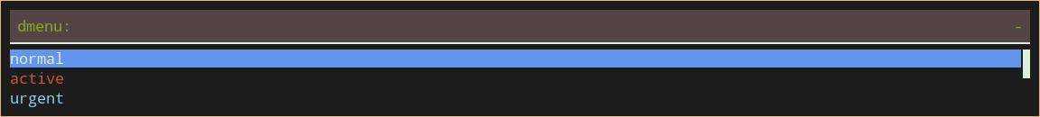
The current theme does not show what row is selected, so lets make those different background color. For this we add:
#window mainbox listview element selected {
    background: @blue;
}
This already gives us a usable theme. Lets extend it, so urgent and active rows are visible:
#window mainbox listview element normal active {
    foreground: @lightblue;
}
#window mainbox listview element normal urgent {
    foreground: @lightred;
}
#window mainbox listview element alternate active {
    foreground: @lightblue;
}
#window mainbox listview element alternate urgent {
    foreground: @lightred;
}
So why does this require so many options (and we are not there yet)?
We see two times 3 properties now:
The first is the type of the row:
- normal:
- alternate: (all uneven rows)
- selected:
Then each of these can be in three states:
- normal
- urgent
- active
Idealy a full theme sets all of these options.
* {
    foreground:  #ddeedd;
    background:  #1c1c1c;
    // Black
    black:       #3d352a;
    lightblack:  #554444;
    //
    // Red
    red:         #cd5c5c;
    lightred:    #cc5533;
    //
    // Green
    green:       #86af80;
    lightgreen:  #88aa22;
    //
    // Yellow
    yellow:      #e8ae5b;
    lightyellow:     #ffa75d;
    //
    // Blue
    blue:      #6495ed;
    lightblue:     #87ceeb;
    //
    // Magenta
    magenta:      #deb887;
    lightmagenta:     #996600;
    //
    // Cyan
    cyan:      #b0c4de;
    lightcyan:     #b0c4de;
    //
    // White
    white:      #bbaa99;
    lightwhite:     #ddccbb;
    //
    // Bold, Italic, Underline
    highlight:     bold #ffffff;
}
#window {
    location: center;
    anchor:   north;
}
#window box {
    padding: 10px;
    border:  1px;
    foreground: @magenta;
}


#window mainbox inputbar {
    background: @lightblack;
    text: @lightgreen;
    padding: 4px;
}
#window mainbox inputbar box {
    border: 0px 0px 2px 0px;
}
#window mainbox box {
    spacing: 0.3em;
}

#window mainbox listview element selected  normal {
    background: @blue;
}
#window mainbox listview element normal active {
    foreground: @lightblue;
}
#window mainbox listview element normal urgent {
    foreground: @lightred;
}
#window mainbox listview element alternate normal {
}
#window mainbox listview element alternate active {
    foreground: @lightblue;
}
#window mainbox listview element alternate urgent {
    foreground: @lightred;
}
#window mainbox listview element selected active {
    background: @lightblue;
    foreground: @background;
}
#window mainbox listview element selected urgent {
    background: @lightred;
    foreground: @background;
}
#window mainbox listview element normal normal {

}
Note here, empty sections, because we want them to inherit from their parents, can be left out.
This is a first quick tutorial into writing a theme. There are a lot more options that can be tweaked. For this see the full TODO theme specification.
Advanced
To make the theme transparent, more care had to be taken. Because every widget renders over the underlying widget (with it transparency value). You cannot just set one background color as main property. This would result in:
There is an easy way to fix this. Set the default background to be fully transparent:
* {
    background: rgba(0,0,0,0);
}
Now every widget without an explicit background, is going to be transparent. We can then set the background of the window to the desired transparent color:
#window box {
    background: #881c1c1c;
}
This looks a lot nicer:
Now by updating the remaining backgrounds you can tweak the theme to have a nice overall look.