Describe hover, focus and active states for primary and secondary
buttons.

Organized the icons section in a table. Replaced images for icons
so they are all the same size.

Organized the color section in a table. Replaced the images with
new ones so the table would have a more manageable size. Updated
the values for some colors to show the $color-light shade.

Remove commented sections

Remove `db/schema.rb`

Add db/schema.rb from origin/master

Fix typos
3.4 KiB
Basics
Contents
Responsive
GitLab is a responsive experience that works well across all screen sizes, from mobile devices to large monitors. In order to provide a great user experience, the core functionality (browsing files, creating issues, writing comments, etc.) must be available at all resolutions. However, due to size limitations, some secondary functionality may be hidden on smaller screens. Please keep this functionality limited to rare actions that aren't expected to be needed on small devices.
Typography
Primary typeface
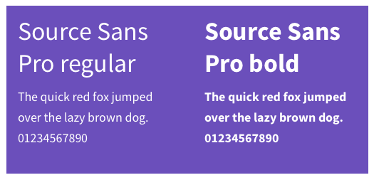
GitLab's main typeface used throughout the UI is Source Sans Pro. We support both the bold and regular weight.
Monospace typeface
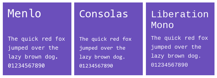
This is the typeface used for code blocks. GitLab uses the OS default font.
- Menlo (Mac)
- Consolas (Windows)
- Liberation Mono (Linux)
Icons
GitLab uses Font Awesome icons throughout our interface.
TODO: update this section, add more general guidance to icon usage and personality, etc.
Color
TODO: Establish a perspective for color in terms of our personality and rationalize with Marketing usage.
Motion
Motion is a tool to help convey important relationships, changes or transitions between elements. It should be used sparingly and intentionally, highlighting the right elements at the right moment.
TODO: Determine a more concrete perspective on motion, create consistent easing/timing curves to follow.
Voice and tone
The copy for GitLab is clear and direct. We strike a clear balance between professional and friendly. We can empathesize with users (such as celebrating completing all Todos), and remain respectful of the importance of the work. We are that trusted, friendly coworker that is helpful and understanding.


